Originally the graphs were simple mathematical displays. However through user testing I found that a lightbulb was an easy symbol for people to relate to and understand.
Therefore I have changed the energy use display to how a lightbulb shines. Every 3 hours are represented by a cycle of the light.
DSDN 112 Julie Drake
Search This Blog
Thursday, 13 October 2011
Changes:
Changes:
The original town was too bright so I dulled down the colours used.
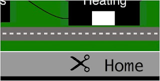
Originally the user could click on a specific power line and this would turn off that aspect in the real house. However when I did user testing that was difficult for the user as the line is so thin. So I have changed it to clicking a pair of scissors which in turn cut the line.

Originally my graphs were too mathematical compared to the rest of my interface so I have changed them to be more basic to read.
Monday, 26 September 2011
River
I have used the river for two reasons. It adds depth to the picture and creates a more scenic and utopian view for the town, giving a small country town feel.
Also I feel that this separates the two different modes within the picture. On the farthest side of the river there is the total power use and the windmills which show how much power must be made. On the nearer side there are the appliances and areas that are using power, showing the two contrasts.
I feel that keeping them separate with the river helps to create a divide and a better understanding.
Town concept
Once I had the town concept I tried experimenting with the idea of how energy would be produced within the town.
Shown in the background that would be used. I would then put on the blades of the windmills in flash so that they can rotate in real time.
While it doesn't look too busy at the moment I found that once I had the animation of the windmills and the houses placed between the road and the river, it was too crowded. Also I added a power line that connected the houses and power box which caused it to be busier.
Therefore I have decided to take out the water damn. I feel it was unnecessary and could have caused confusion as well.
More concepts
I found that the idea I handed in for the concept part of the project still wasn't cohesive with what I wanted to do. It became too complicated and would have been hard to develop in a way that showed people how different areas of their home consumed energy. Therefore I came up with a few more ideas that still enveloped the same ideas but were presented in a different way.
One focused on a skyline where the buildings would each represent an area within the home and the lights in the building would move up and down the levels dependent on how much energy was being used.
One of the other concepts involved windmills and showed them in comparison to each other when they each represented an energy area in the home
In the end I merged the two ideas to create a concept of a small town that represents the energy use in the home. This way the family could look at how much energy the windmills are required to produce, while also seeing specific aspects of their home.
Subscribe to:
Comments (Atom)


