The original town was too bright so I dulled down the colours used.
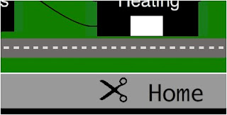
Originally the user could click on a specific power line and this would turn off that aspect in the real house. However when I did user testing that was difficult for the user as the line is so thin. So I have changed it to clicking a pair of scissors which in turn cut the line.
Originally my graphs were too mathematical compared to the rest of my interface so I have changed them to be more basic to read.


