Search This Blog

Thursday 13 October 2011

Graph changes

Originally the graphs were simple mathematical displays. However through user testing I found that a lightbulb was an easy symbol for people to relate to and understand.

Therefore I have changed the energy use display to how a lightbulb shines. Every 3 hours are represented by a cycle of the light.

Changes:

Changes:

The original town was too bright so I dulled down the colours used. 

Originally the user could click on a specific power line and this would turn off that aspect in the real house. However when I did user testing that was difficult for the user as the line is so thin. So I have changed it to clicking a pair of scissors which in turn cut the line.


Originally my graphs were too mathematical compared to the rest of my interface so I have changed them to be more basic to read.

Monday 26 September 2011

River

I have used the river for two reasons. It adds depth to the picture and creates a more scenic and utopian view for the town, giving a small country town feel.
Also I feel that this separates the two different modes within the picture. On the farthest side of the river there is the total power use and the windmills which show how much power must be made. On the nearer side there are the appliances and areas that are using power, showing the two contrasts.
I feel that keeping them separate with the river helps to create a divide and a better understanding.


Town concept

Once I had the town concept I tried experimenting with the idea of how energy would be produced within the town.

Shown in the background that would be used. I would then put on the blades of the windmills in flash so that they can rotate in real time. 

While it doesn't look too busy at the moment I found that once I had the animation of the windmills and the houses placed between the road and the river, it was too crowded. Also I added a power line that connected the houses and power box which caused it to be busier.
Therefore I have decided to take out the water damn. I feel it was unnecessary and could have caused confusion as well.

More concepts

I found that the idea I handed in for the concept part of the project still wasn't cohesive with what I wanted to do. It became too complicated and would have been hard to develop in a way that showed people how different areas of their home consumed energy. Therefore I came up with a few more ideas that still enveloped the same ideas but were presented in a different way. 


One focused on a skyline where the buildings would each represent an area within the home and the lights in the building would move up and down the levels dependent on how much energy was being used.

One of the other concepts involved windmills and showed them in comparison to each other when they each represented an energy area in the home

In the end I merged the two ideas to create a concept of a small town that represents the energy use in the home. This way the family could look at how much energy the windmills are required to produce, while also seeing specific aspects of their home.

Sunday 11 September 2011

Prototype

Description

The basis of my design involves educating people in general about different appliances and how much energy each uses comparatively, in a fun way. This will be done by having a user for the avatar ,which is being chased by an energy ‘monster’. The ‘monster’ will be made from different appliances and the more energy being used in the house, the bigger the ‘monster’ will be and the faster it will run.  The user can click on a specific appliance that is being used and thereby turn it off, causing the ‘monster’ to slow down and shrink,. Each appliance will also be proportionally sized according to how much energy it uses. I have also placed an energy meter within the design so there is a tangible recording of how they should be doing. I would use technology to monitor each appliance within the house and send the information back to the application on the iPad. In addition, there is a tally of how many days, in real time, their avatar has been alive for which could be uploaded into social networks so they can compare their progress with peers and friends. This will give the user a chance to see if they are being energy conscious over a long period of time. My design aims to help users understand how different appliances use energy in a creative and fun way. It would bring a competitive aspect into energy use and could be easily applied to any home.

Concepts 3

Sketches based on the idea of the user turning off appliances and seeing them in comparison

Concepts 2

Here I have sketched out some concepts that are based on the idea of the user being able to 'delete' appliances- turning them off- and seeing how it affects the display.


Thursday 8 September 2011

Concept

This was my original idea, but I feel that it could be too simple and that I could go into different aspects.
The picture above shows the original display that would be seen when the application is opened. There would be a list of the different aspects of energy shown. etc heat, light and water. Each would be awarded a colour dependent on how the energy was in that aspect. In the example above water is doing well, heat is medium and light is using too much. Therefore if you clicked into the light part, it would show a bright screen, where the avatar was cringing away from the light. Conversely, the water part would show a healthy planet with a happy avatar. The total would show a mix, where the avatar may not be completely happy and the earth might be slightly affected- the land might be brown. 

I feel that this might not be interactive enough and could be made better by educating people about each aspect in detail more.

IPad

I've decided to use the iPad as my digital media. I think that they are coming more and more common and most people are already aware of how to use them. The overall product will be able to be transferred to other apple touch products, such as the iPod touch or iPhone, but I think it will be easier to explain and showcase my design through an iPad because it is the most appropriate size.

Tamagotchi

As well as the wilting energy flower, I am also using the tamagotchi for inspiration. Just like with the tamagotchi my application on the ipad will involve the user looking after their personal avatar. However, instead of just being able to push buttons and feed or change their mood, their avatar will change according to the energy used.


The main idea I will be taking from this is the idea of a digital pet which is affected by how much you care for it. It also illustrates the point that they can't just leave it alone for days at a time, because energy requires constant care.

Monday 29 August 2011

Power consumption

I've found the energy monitoring an interesting experiment and it has made me see how different appliances consume. I've been interested in mostly everyday objects, not just technological, but kitchenware etc.


To see that the jug uses so much compared to a light, yet we are unconcerned with energy saving jugs, yet we have so many different energy bulbs today. I think looking at these different factors makes me look at what the problems are and how I could use the next project to look at them.

Monday 15 August 2011

Energy research


Today we researched the different energy monitors and ways that we can save energy. The parts I found interesting were where the designer had created a product that was enjoyable to use. Such as this flower.


It monitors the energy used in the house and moves accordingly. If the energy use is good then it is open and a purple/blue. As it gets worse it starts to close and then finally when the energy is dire it closes up and bends over as if dying.

Thursday 11 August 2011

Description


The concept of my design is to experience textures through only touch, without the aid of sight. This causes the user to depend on what they feel and allocate it to a colour, displaying links between the two senses that are not usually obvious. Because we usually depend on at least two senses (e.g. sight and touch), having to rely on one changes the encounter and creates a new experience.
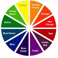
            To achieve this experience in the most truthful way I created black boxes that each contains different textures. Each of these textures is not a common texture and so is quite unrecognizable. This way the user cannot picture how the texture looks in their mind, causing authenticity because they must go on touch alone. When all of the boxes are placed on an assigned colour there is a texture wheel created. Users can then feel and see how they relate each texture in their mind, without sight obstructing their view. As a colour wheel merges from one colour to the next, so will their texture wheel.
             My experience causes users to examine their perceptions and realize how much they rely on each sense for diverse information.

Final 5 pictures


There are 6 boxes, each containing a separate texture, and a colour wheel with spokes to fit each box into.


Place your hand through the first box's slot and feel the texture inside.


Assign that box to the colour you feel it best represents.


Repeat this with each box until you have assigned each box to a colour.


You now have a complete texture wheel.


Wednesday 10 August 2011

White and grey

When I tested out my experience at a tutorial I found that people who hadn't heard my concept didn't find it an intuitive object. There was no real indication of where to interact with it as the boxes were all black and the colour wheel was simply there. 
To fix this, I have decided to line each colour of the colour wheel with a white outline that draws the eye to the centre, just like the picture below. This immediately makes the user think that the centre is where they must interact.


Also I have changed the flaps' colour to grey so that the eye is drawn there. Before, it was difficult to see where to put your hand in, but now it has a clear opening.

Thursday 4 August 2011

Flaps

Instead of just holes into the boxes, I have decided to put flaps also so that there is no way to see inside. Before, when they pulled their hand out the fabric flicked out, but now it's obstructed and therefore more effective.

Tuesday 2 August 2011

Mock-up

This is a small mock-up of my design to see how it would look if each box, containing a texture, were to slot into a central spiral. Also I wanted to see if they could all sit on top of a colour wheel, so that it could be seen, despite how each piece is placed.


Monday 1 August 2011

Textures-metal


Today I tried to reshape some metal to create my own textures, however I found that it is too sharp. So I will find something else that can be crafted and molded, but that isn't so sharp as to cut the user. eg the picture below.

Sunday 31 July 2011

Shape

Originally I thought that I would just have my textures being held in plain black boxes. However I think that this is far too plain and not as interactive as possible. I will change it so that the boxes can be moved and placed together to create a colour wheel. This also means that the colours will be immovable, so there is no chance of them being lost. I believe that this will also make it more interactive as it will create a texture wheel that relates to a colour wheel- making the user understand how they see texture progressing.
                 

Monday 25 July 2011

Textures in my boxes


I have decided that I will use textures in my boxes that are more unrecognizable than I currently have. As it were the textures I used in my experiment were too obvious and so people could associate them with a tangible item, meaning the colour was based on what the object looks like. If I use more unusual objects, this is less likely to happen.
    I will also look at making my own texture. When I trialed the home made goo, people were unable to recognize it so went purely off touch. I will attempt to do the same with different textures in the future.

An example of how I could beat metal to define my own textures


Colour choice


Today I looked at whether I should have multiple colours available for each box, or whether the user should have a restricted number to match on the whole. The latter option would mean that they are forced to make a decision over the textures they feel, where as the first would offer a safe option. I think that making them decide from a restricted amount will create a more intense experience so I will go with that.

Sunday 24 July 2011

A3 Storyboard- Assignment 1

Part A: WRITTEN DESCRIPTION

      I plan to create a sensory experience for your touch. I will do this by creating six boxes, with different textures inside. The boxes will be blacked out so the interior is unknown by the user and will also have an entry point where the user can insert their hand. The user will then attempt to feel the texture inside and assign a specific colour to it. 
      I will use textures that will be unrecognizable so that the user cannot go off how they know the object looks. I plan to use textures such as toothpicks, bubble wrap, fur, tinsel, a goo that I will create and a sticky surface, such as cellotape.
     The user will have to rely on their touch alone to match the texture with a colour, which is usually based on sight. It will also intensify their experience and their senses, as they will have one sense blocked, forcing them to rely on others. This will create a unique experience that flips the senses, as the user won’t know what they will be feeling next. It will also display how different people perceive colours and what they relate to certain textures. 

Experiment

In tutorials I experimented with people associating textures with either words or colours by covering the texture so they couldn't see it. I found that the colours were a lot less limiting than the words as they were more to do with the person's perspective than common thoughts. 

Textures

I researched different textures to see which were affective in making the user think and were also enjoyable. I have so far chosen toothpicks, bubble wrap, some sort of goo and tinsel